Text Speak.io
Converting text to speech for visually impaired users
Converting text to speech for visually impaired users
Converting text to speech for visually impaired users
A tool that transforms the way users consume online content by converting online text into to something you can listen to, enabling users to access information and articles through audio.
A tool that transforms the way users consume online content by converting online text into to something you can listen to, enabling users to access information and articles through audio.
A tool that transforms the way users consume online content by converting online text into to something you can listen to, enabling users to access information and articles through audio.


Timeline
2 Months
Team
Solo Designer
Platform
Webapp
Roles
User Research, Usability Testing, Visual Design,
Prototyping, User Flows
Timeline
Timeline
2 Months
2 Months
Platform
Platform
Webapp
Webapp
Roles
Roles
User Research,
Usability Testing,
Visual Design,
Prototyping, User Flows
Team
Team
Solo Designer
Solo Designer
The Problem
The Problem
The Problem
Eye Strain and Limited Accessibility Hinder Content Consumption
Eye Strain and Limited Accessibility Hinder Content Consumption
Eye Strain and Limited Accessibility Hinder Content Consumption


The Solution
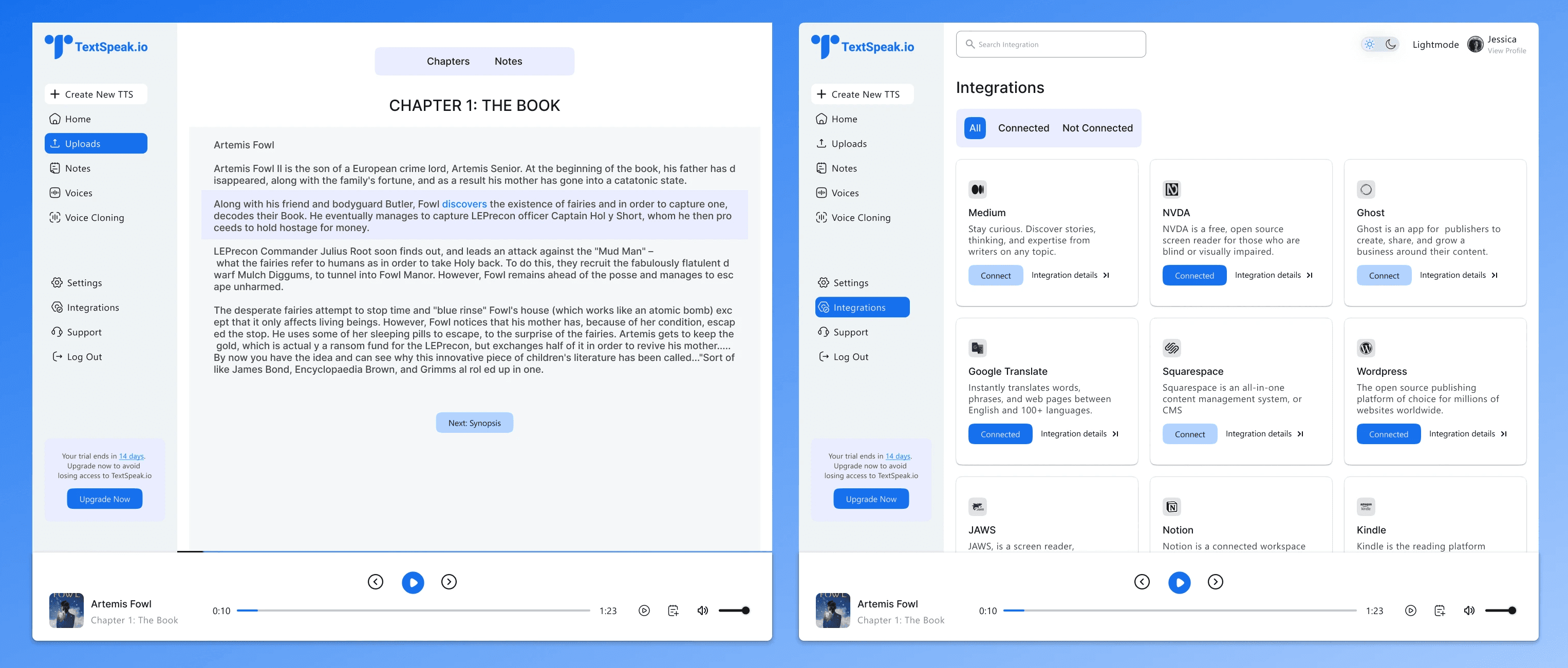
Design a user-friendly and customizable text-to-speech application that seamlessly integrates with existing accessibility tools.
This would allow users to consume information through audio while tailoring the experience to their preferences and working alongside their current accessibility apps.This app would easily convert online articles, blog posts, and other text content into lifelike spoken words, reducing the need to stare at screens for prolonged periods.
The Solution
The Solution
Design a user-friendly and customizable text-to-speech application that seamlessly integrates with existing accessibility tools.
Design a user-friendly and customizable text-to-speech application that seamlessly integrates with existing accessibility tools.
This would allow users to consume information through audio while tailoring the experience to their preferences and working alongside their current accessibility apps.This app would easily convert online articles, blog posts, and other text content into lifelike spoken words, reducing the need to stare at screens for prolonged periods.
This would allow users to consume information through audio while tailoring the experience to their preferences and working alongside their current accessibility apps.This app would easily convert online articles, blog posts, and other text content into lifelike spoken words, reducing the need to stare at screens for prolonged periods.


Where do i start ?
Where do i start ?
My Approach
My Approach
My Approach


Talking to Target Users to Understand their Mindsets
Talking to Target Users to Understand their Mindsets
Talking to Target Users to Understand their Mindsets
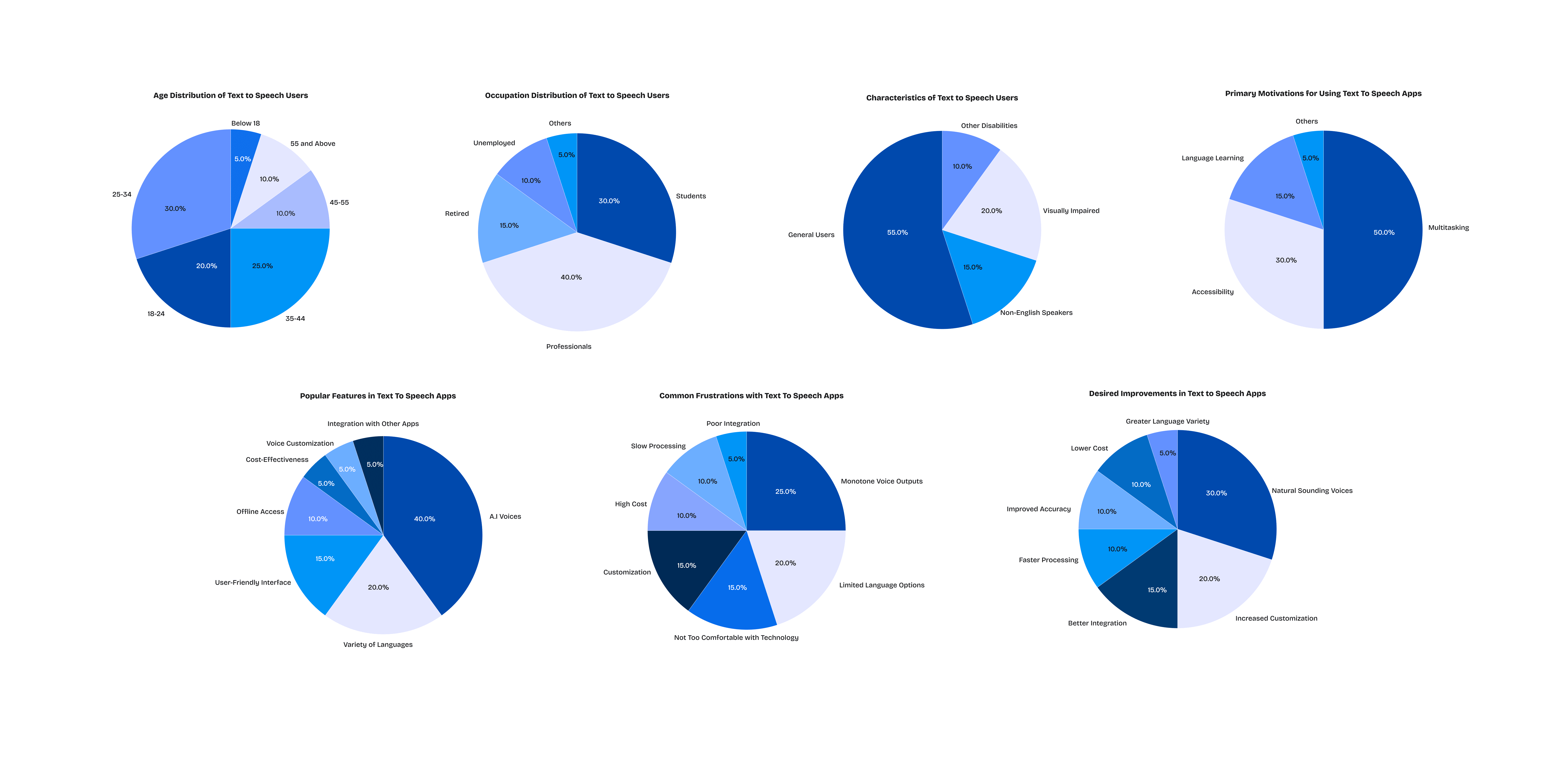
I wanted to learn more about people who use text-to-speech apps. To do this, I started with a survey. This survey helped me identify the typical user of text-to-speech apps by asking questions about demographics, motivations, and frustrations. I also included questions about the apps they currently use and what improvements they wanted to see.
Sharing the survey link on social media and online communities got me valuable responses, and even helped me recruit interview participants.
Next, I interviewed a few people who had already experimented with different text to speech apps. These were my ideal candidates because they were potential users with real-world experience. During the interviews, I focused on understanding their "why"( the reasons behind using these apps), their decision-making process, and their comfort level with the technology.
Interesting Insights from User Research
By analyzing the data from interviews and survey, I uncovered some interesting insights into the people who use text-to-speech apps
Interesting Insights from User Research
By analyzing the data from interviews and survey, I uncovered some interesting insights into the people who use text-to-speech apps


Competitive Analysis
What solutions have already been created?
Through the interviews and survey, I gained valuable insights not just into user behavior, but also into the competitive landscape. Participants mentioned several text-to-speech apps they currently used or had tried before.
Three(3) apps in particular stood out: Listening.io, Blogaudio, and Listnr.ai.
Knowing these competitors existed, I dug deeper. I performed a competitive analysis to understand how users accessed information and articles through audio on these platforms. This involved detailed assessments of their functionalities. To get a truly well-rounded perspective, I also went hands-on and tried out some of these competitor apps myself. This firsthand experience allowed me to not only identify what they were doing well, but also connect those strengths to my existing understanding of why they might have made those design choices.
Creating User Personas to Guide Design Decisions
Creating User Personas to Guide design decisions
By further analyzing the interview and survey data I was able to create four user personas. These personas represent distinct user groups, each with unique needs, motivations, and challenges.
By further analyzing the interview and survey data I was able to create four user personas. These personas represent distinct user groups, each with unique needs, motivations, and challenges.


Throughout the design process, I consistently referred back to these personas. They served as a constant reminder of the real people I was designing for. By keeping their needs in mind, I could ensure that the features I designed would resonate with real users and address their specific pain points. Also, accessibility considerations were factored into the creation of user personas. Understanding the specific challenges faced by users with visual impairments helped shape the app's features and functionalities.
Throughout the design process, I consistently referred back to these personas. They served as a constant reminder of the real people I was designing for. By keeping their needs in mind, I could ensure that the features I designed would resonate with real users and address their specific pain points. Also, accessibility considerations were factored into the creation of user personas. Understanding the specific challenges faced by users with visual impairments helped shape the app's features and functionalities.
Customer Journey Map
Visualizing the steps and experiences a user goes through
Visualizing the steps and experiences a user goes through
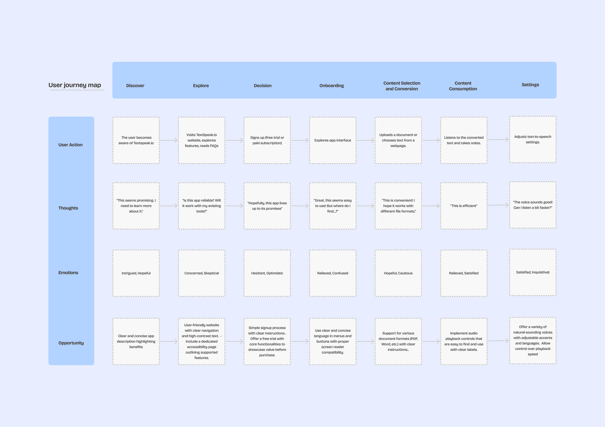
To gain a deep understanding of how users interact with the product, I created a user journey map.
This map visualized the entire user experience, from initial awareness to ongoing use. By following the user's steps,
I was able to identify potential pain points, areas for improvement and areas where accessibility features
could be most beneficial.


Brainstorming
Brainstorming
After gathering a wealth of user research data, I needed a way to organize and prioritize my findings. Affinity mapping proved to be efficient for this. By grouping similar findings together, I was able to categorize the insights into three key areas: pain points, wants, and needs for each user persona. By focusing on these areas, I ensured my efforts targeted the most pressing issues for each user group.
Having identified key user needs through affinity mapping, I turned my attention to brainstorming solutions for the identified pain points. To achieve this quickly and efficiently, I utilized a technique called “rapid ideation." This involved short, timed exercises to generate a large volume of solutions in a short period. The goal was to generate as many solutions as possible, regardless of their feasibility.


Sketches
Sketches
Instead of jumping directly into low-fidelity designs, I focused on quick, rough sketches. This allowed me to explore a wide range of design ideas in a shorter timeframe without getting caught up in the specifics early on. By following this approach, I was able to freely generate and evaluate different UI concepts.
Instead of jumping directly into low-fidelity designs, I focused on quick, rough sketches. This allowed me to explore a wide range of design ideas in a shorter timeframe without getting caught up in the specifics early on. By following this approach, I was able to freely generate and evaluate different UI concepts.
The MoSCOW Framework
Prioritizing a Simple User Experience
The MoSCOW Framework
Prioritizing a Simple User Experience
While sketching various design ideas, I recognized the potential for feature overload, which could overwhelm users and complicate the interface, especially for those with visual impairments. To address this challenge and ensure a user-friendly experience, I used the MoSCoW framework to prioritize features into four categories
1. Must Have: Absolutely essential features that form the core functionality of the app and address critical user needs.
2. Should Have: Important features that enhance the user experience and address secondary needs.
3. Could Have: Desirable features that can be added in later iterations.
4. Won't Have: Unnecessary features that will not be included.
By focusing on Must Have and Should Have features that directly address user needs, I ensured the core functionalities were well-defined and addressed the most critical user pain points. This approach also helped identify features for potential future iterations (Could Have) or excluded altogether (Won't Have) to maintain a simple and Uncomplicated interface.


Flows and Wireframes
Flows and Wireframes
Drawing on the solutions identified during brainstorming, I created user flows which I used to map out the specific paths users might take within the app to achieve their goals.
Drawing on the solutions identified during brainstorming, I created user flows which I used to map out the specific paths users might take within the app to achieve their goals.


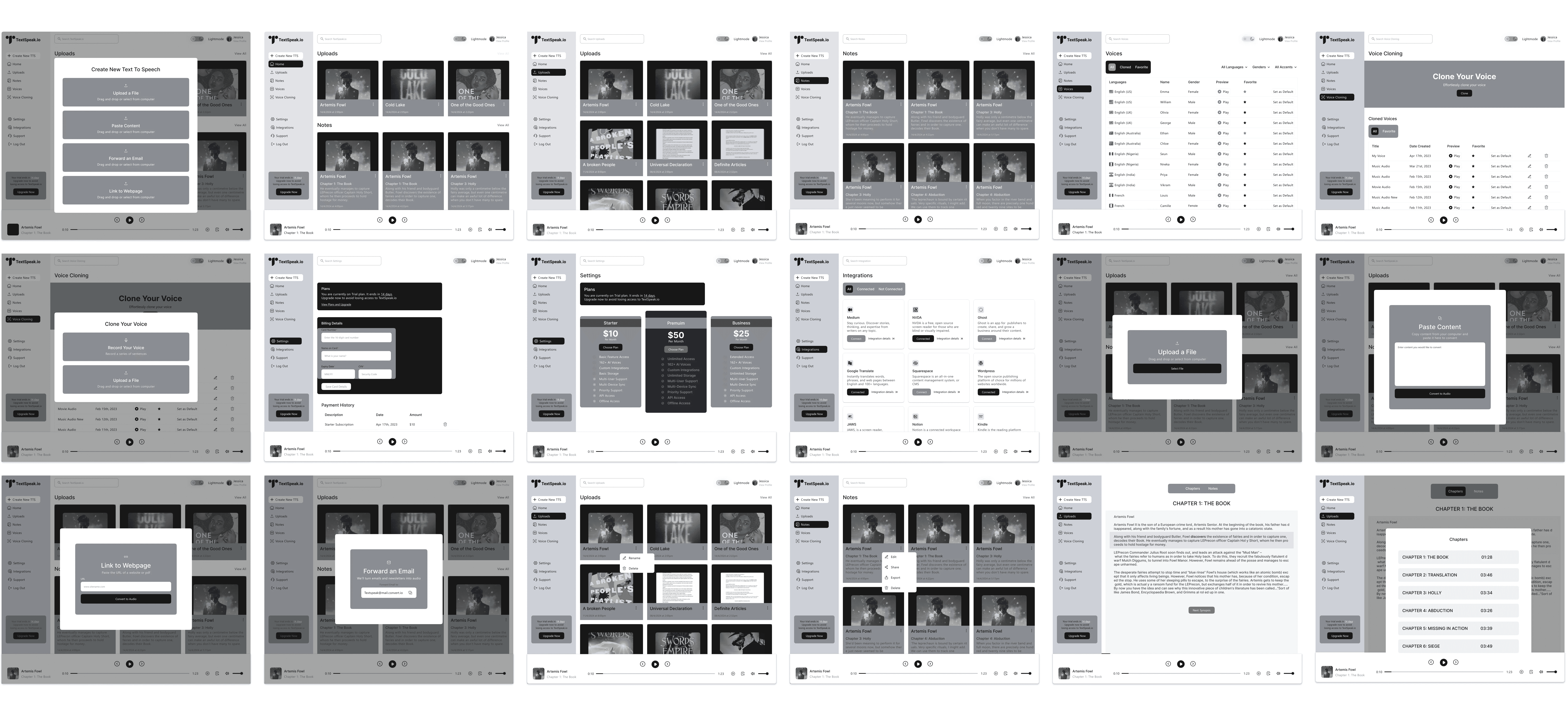
With these user flows in mind, I created the following wireframes to visualize the user journeys and interaction points. These initial wireframes were low-fidelity, focusing on core features.
With these user flows in mind, I created the following wireframes to visualize the user journeys and interaction points. These initial wireframes were low-fidelity, focusing on core features.


Usability testing, findings & iterations
Once I had a set of wireframes, I created a prototype from the wireframes and brought it to potential users for feedback.
Through user testing sessions, I discovered that users could navigate the experience with ease. However, valuable feedback also revealed some areas for improvement. This took me back to the drawing board where I made improvements.
Voice Speed Elusive: Users struggled to find the voice speed customization option. This highlighted a discoverability issue within the interface.
Once I had a set of wireframes, I created a prototype from the wireframes and brought it to potential users for feedback.
Through user testing sessions, I discovered that users could navigate the experience with ease. However, valuable feedback also revealed some areas for improvement. This took me back to the drawing board where I made improvements.
Voice Speed Elusive: Users struggled to find th)e voice speed customization option. This highlighted a discoverability issue within the interface.


The design was revised to make the voice speed customization option more prominent and easier to locate.
The design was revised to make the voice speed customization option more prominent and easier to locate.
Missing Text Copy-Paste: Users expressed a need to copy and paste long text messages for voice playback. This functionality wasn't present in the initial prototype.
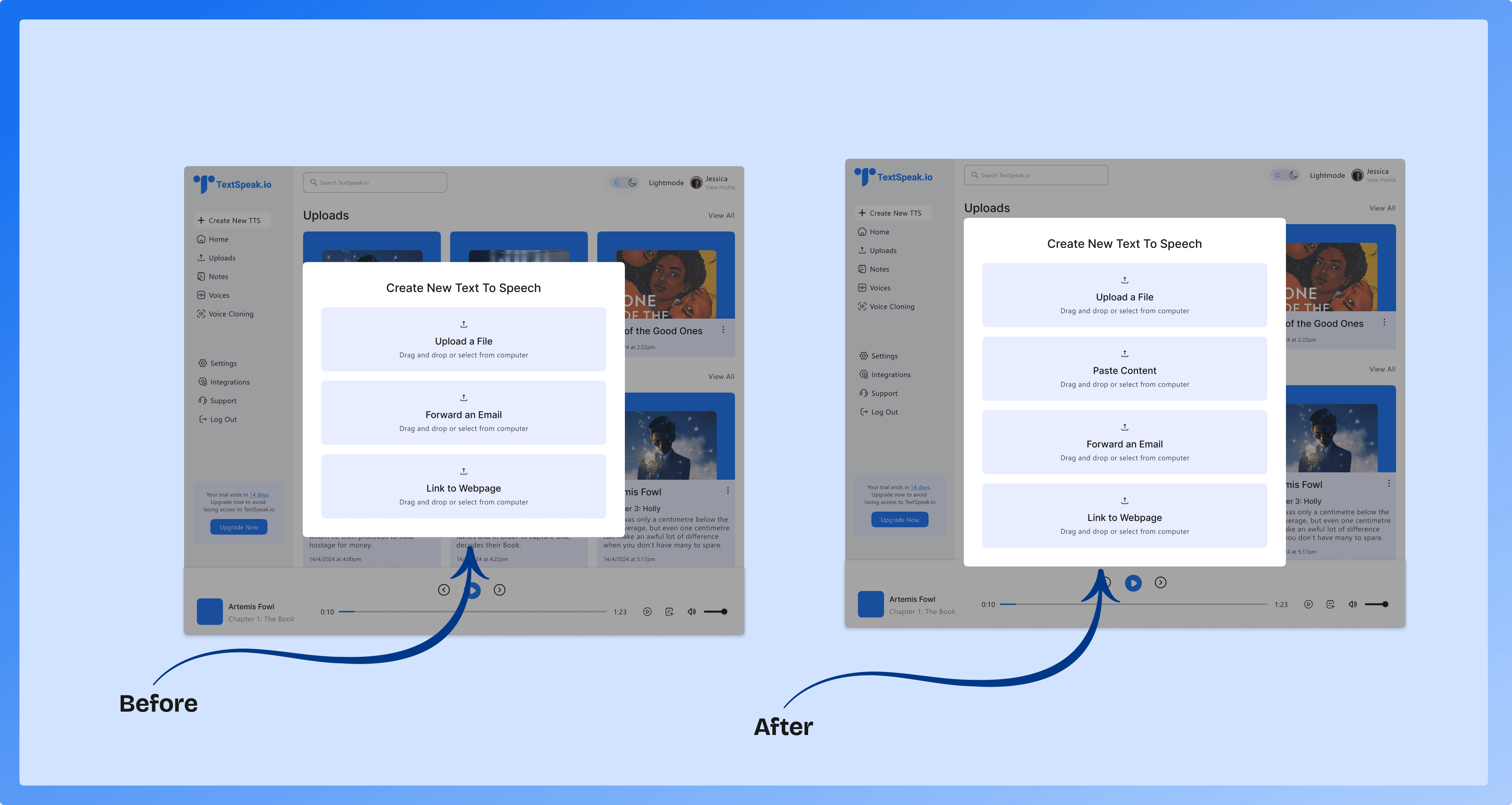

The functionality to copy and paste long text messages for voice playback was incorporated into the prototype.
Missing Text Copy-Paste: Users expressed a need to copy and paste long text messages for voice playback. This functionality wasn't present in the initial prototype.

The functionality to copy and paste long text messages for voice playback was incorporated into the prototype.
Missing Text Copy-Paste: Users expressed a need to copy and paste long text messages for voice playback. This functionality wasn't present in the initial prototype.


The functionality to copy and paste long text messages for voice playback was incorporated into the prototype.
Confusing Plans Page: The UI design of the Plans page wasn't clear. Users mistook a heading for a button, leading to confusion.
Confusing Plans Page: The UI design of the Plans page wasn't clear. Users mistook a heading for a button, leading to confusion.
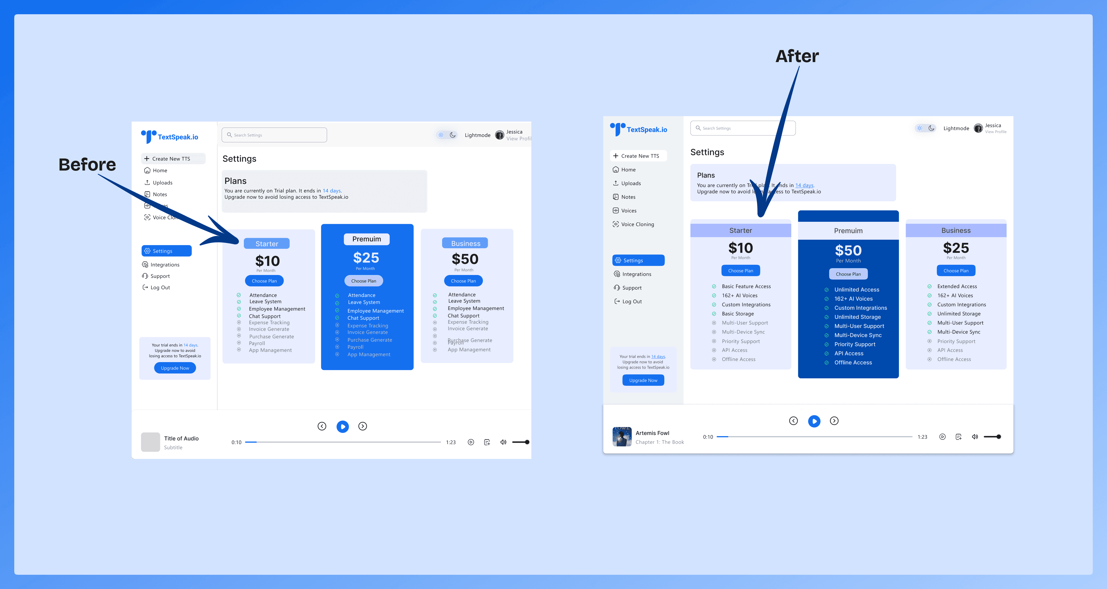


The UI of the Plans page was reworked to clearly differentiate between headings and buttons, eliminating confusion.
The UI of the Plans page was reworked to clearly differentiate between headings and buttons, eliminating confusion.
These Iterations resulted in a more user-friendly and intuitive prototype, which was an interactive mockup of the app, brought to potential users for further feedback.
These Iterations resulted in a more user-friendly and intuitive prototype, which was an interactive mockup of the app, brought to potential users for further feedback.
Final Designs
Final Designs
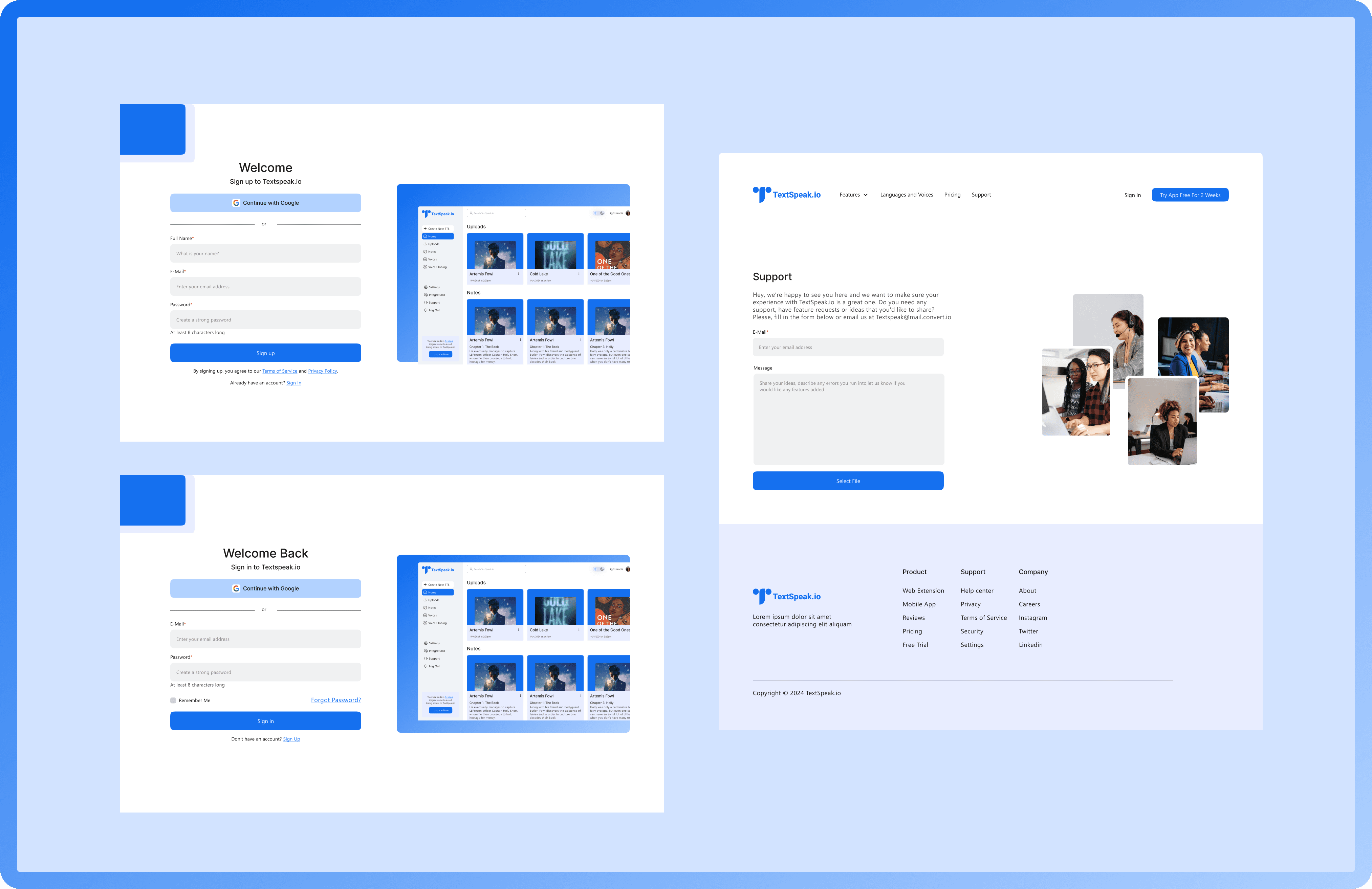
Following the implemented improvements, the second round of testing yielded significantly more positive results.
Following the implemented improvements, the second round of testing yielded significantly more positive results.




Reflection
Reflection
Prioritization and Tradeoffs: There are limitations on resources (time, budget) and features. While it's tempting to pack in every feature imaginable, knowing when to make trade-offs is essential.
Adaptability is Key: Unexpected challenges or surprising user behavior may necessitate adjustments to your initial plans. Being flexible and ready to adapt your design based on new information is crucial.
Embrace the Challenge: Unexpected findings can be valuable opportunities to improve the app. Remain open-minded and use these insights to create a better user experience.
Next Project
Next Project
Mobile App
Simplifying the purchase of carbon credits
A user friendly mobile application that simplifies the process for software companies to discover and engage in greenhouse gas reduction projects, enabling them to earn carbon credits.
Mobile App
Simplifying the purchase of carbon credits
A user friendly mobile application that simplifies the process for software companies to discover and engage in greenhouse gas reduction projects, enabling them to earn carbon credits.

Mobile App
Simplifying the purchase of carbon credits
A user friendly mobile application that simplifies the process for software companies to discover and engage in greenhouse gas reduction projects, enabling them to earn carbon credits.

